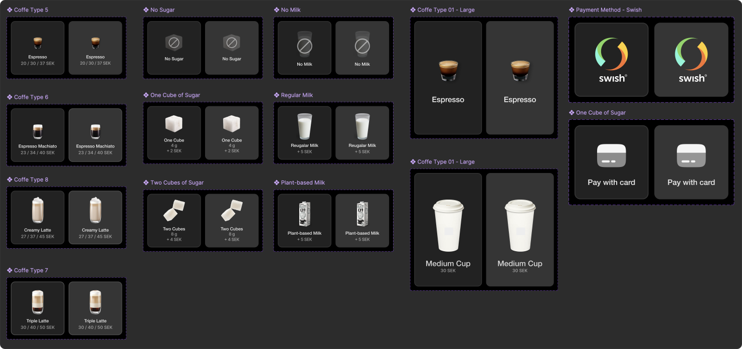
Coffee Machine UI Wireframes – A UX Case Study
Overview
This project focuses on designing an intuitive UI for a coffee machine. It explores various interaction
approaches, balancing clarity, minimalism, and visual feedback.

Sketch Concepts & Interaction Approaches
Different interaction designs emerge in our sketches:
- Sketch 1: Features a well-defined button for direct user engagement.
- Sketch 2: Takes a minimalist approach, removing defined buttons while maintaining usability.
- Sketch 3: Relies on user familiarity, greeting users instead of using traditional UI elements.


Interaction Design Principles
1. Affordances & Visual Guidance: Clear, highly visible buttons guide users naturally.
2. Reducing User Errors & Providing Feedback: A minimalistic UI reduces cognitive load and
includes
essential actions such as "Go Back" and "Cancel."
Software with Style – UI & Visual Design
- Minimalist Design: Focused on reducing noise and prioritizing user choices.
- Consistency & Standards: Maintains a uniform layout for seamless interaction.
- Typography: Uses Helvetica Neue for a modern and readable UI.
- Color Palette: Dark, modern tones inspired by coffee for a sleek, professional feel.


You can look at the PDF if you want the whole case
